About this Project
Justice Cream is a WOC-lead, non-profit (mutual aid) ice cream shop that donates 100% of profits to fund grassroots radical liberation work. Through their collaborations with local organizations the ice cream shop co-develops custom ice cream flavours that reflects the social justice issue.
Our team’s goal was to create the non-profits’ own official website. We started from the finding out what their target audience’s needs, creating wireframes matching the existing visual brand and that Justice Cream’s goals for the site were being met.
And finally, ensuring that people can easily navigate the site freely while also being up to date with all things Justice Cream.
My Role
UX Designer/Researcher
Team
1 Project Manager, 5 UX Designers
Timeline
3 months (April 2021 - June 2021)
Tools
Google Meet, Typeform, Figma, Miro, Wix and WordPress
The Challenge
While active on their social media to raise awareness of their events, partnerships and products; Justice Cream wants to have a main hub of information to serve as a critical touchpoint between them and their target audience. The website will be built on a CMS platform.
Proposed Solution
Developing a website would serve as that critical touchpoint in:
Informing their audience about Justice Cream products and opportunities of engagement (ie. partnerships, product ingredients, flavours and donations)
Encouraging community involvement in social justice issues
Making a easier process for both purchasing Justice Cream products and giving donations
Business Opportunities
Increased conversion rates and donations.
Provide information on Justice Cream products and partnerships (ie. flavours, ingredients, information on partner organisations).
More engagement on their social media accounts.
Local community involvement in issues pertaining to social justice.
Technical Constraints
Only 10 weeks to complete project and team members working in between other commitments.
Using an existing CMS platform that the client knows.
To prioritize security of information from extremists wishing to cause harm.
User Research
Before building the site, we wanted to know the target audience that Justice Cream has. The client provided us some data with their general demographic:
Originally the target audience was vegans (as the ice cream is non-dairy) but now their general consumers are around ages 22-34 and mainly based in Chicago that are interested in social justice.
Specific groups include: radical social justice activists (actively participants in a movement/cause), various POC communities, lactose intolerant and vegans and ice cream lovers in general.
The survey was posted on Justice Cream’s Instagram and on our own individual social media accounts.
User Interviews
We interviewed 11 people, asking them about their involvement in the non-profit sphere and love of ice cream.
Most of our interviewees either worked/volunteered for a local organization, donated or just stayed up to date on social issues online.
The main aspects that attracts them to a non-profit were: the cause, mission & values of the organization, the team, how they interact with the community and tangible results in supporting the cause.
Non-Profit Website Expectations:
Wanting to know more about the org’s story/mission
Easy donation process
Past Projects
How to get involved
Transparency of where donations go
Ice Cream Website Expectations:
Nice visuals and vareity of flavours
Information on the flavours (ie. ingredients, sourcing, dietary restrictions, etc.)
Reputation & Reviews on the product
Information on delivery process
Easy checkout process
Personas
According to our mentor, with the research that we gathered, it was best to define our personas based on the social issues and diet restrictions of our users rather than something like age ranges.
With that we are created three user personas: the Social Justice Advocate, the Animal Rights Volunteer and the Adventurous Foodie.
Competitive Analysis
Now that we had a better idea on what the website would have, we wanted to see how similar organisations run their online platforms. Most of the organizations listed here were mentioned by Justice Cream themselves as their source of inspiration.
Key Findings:
Make sure the brand’s mission and values are clearly visible and accessible.
Emphasize information hierarchy without overwhelming the user:
Avoid too much scrolling/information
5 main pages on the navbar is ideal + a sitemap footer for easy accessibility
Give the site it’s own personality with Justice Cream’s existing visual branding but make sure it doesn’t overpower the overall message of the organization.
Moodboard and Colour Palette
While talking with the client and looking over the organisation’s existing Instagram account, it was clear that they wanted a colourful 90’s vibes aesthetic. With that we drafted some potential colour palettes and moodboards for the client to review.
Justice Cream’s current visual branding/colour palette
Our chosen moodboard for the site
Information Architecture
Low Fidelity Wireframes
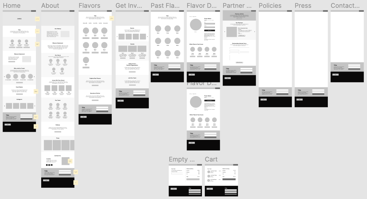
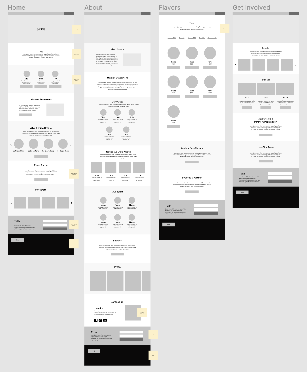
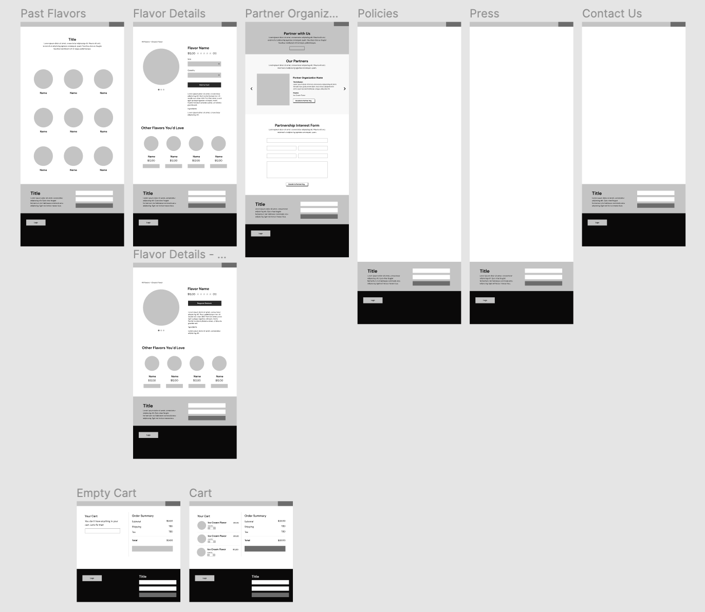
We designed all of the wireframes on Figma and continuously had them reviewed by both our mentor and the client. We decided that the website would be built on Wix, as it was the platform our client knew the best.
That being said, the team thought it was best to leave the wireframes as low-fi on Figma. Mainly due to Wix already having pre-built website templates, we didn’t want to run into the problem of designing a specific layout on Figma only to have it not translate well onto the website builder. So we kept the Figma wireframes as general guidelines.
Luckily we found a template that was close to the Figma version and got to work. The next few weeks were developing the site, adding content given to us by the client and making some changes under the guidance of Justice Cream or due to Wix’s limitations.
Usability Testing
Once we completed the website on Wix, our team conducted usability tests with 7 participants through Zoom.
The main tasks were:
Buying and checkout process of a pint of ice cream
Finding 2 ways to donate on the site
Contacting Justice Cream for collaboration opportunities.
Finding media publications of the organization.
Key Findings:
Users liked the overall colourful visual of the site.
Have better wording for main tabs like “Press” - most users had trouble finding “Reviews & Recognition.”
Make the 2nd way to donate (through the “Get Involved” tab more clear and easier to get to.
High Fidelity Wireframes
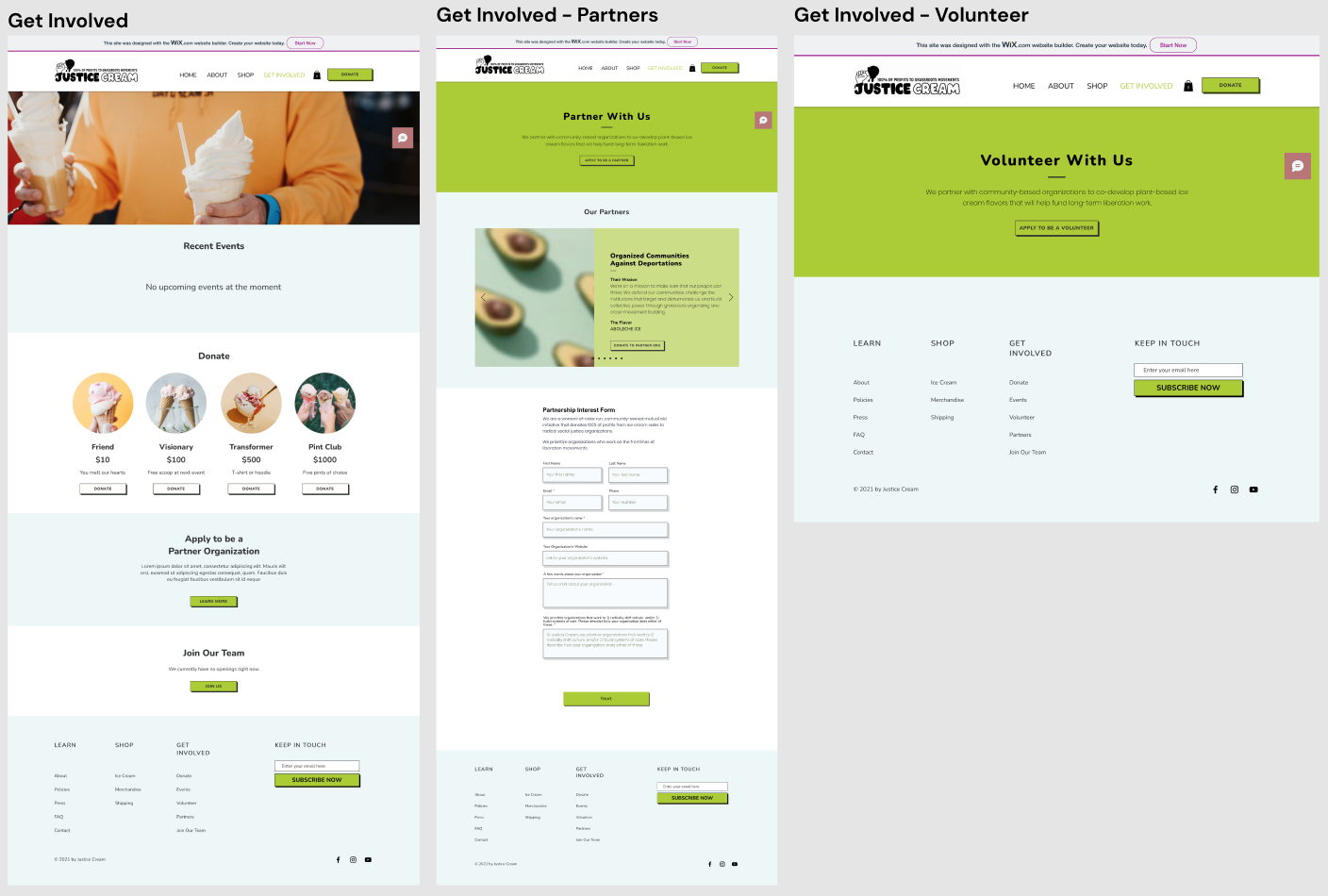
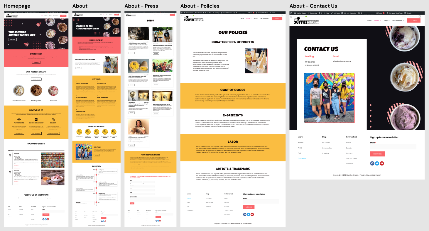
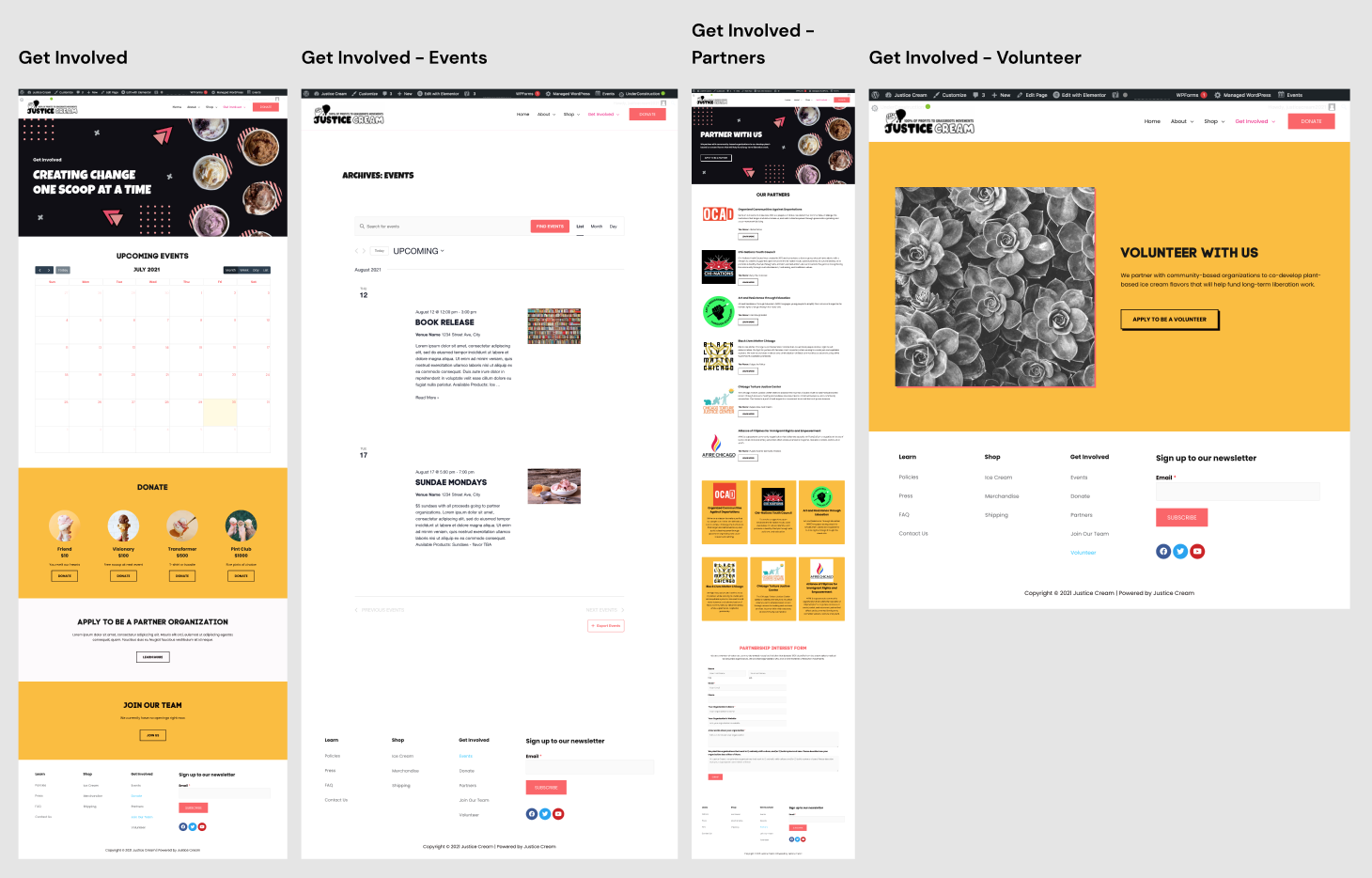
Our team met up for a final design jam to review the results and make the necessary modifications to the website. Afterwards we handed the finished product off to the client for final revisions. Here are the screenshots of the completed site.
Continuation
After the volunteer cycle was finished, the designs were later transferred from Wix to Wordpress, per the client’s request. I, myself, did the transfer with some minor changes to the finished product.
Check out Justice Cream’s Website.
(Changes have been made since website was published).
Reflection
I’m very proud of the work that our team did for Justice Cream and how smoothly the transfer went from WIX to WordPress.
If given more time, I would like to run through a couple more rounds of user testing with the WordPress version to see if there were some issues or glitches that the prototype had. In addition, would have liked to asking some feedback on the overall visual look of the website from others. Also would use more time to develop the mobile responsive design of the site as well.


